

Google Maps brings Android Auto 3D Immersive View to fix the navigation mess
A new 3D look, built for car dashboards, tackles the biggest problems drivers hit with maps today.
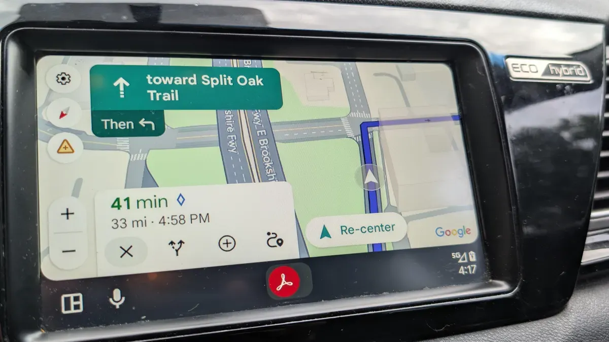
Google Maps has added a new 3D Immersive View experience for Android Auto. For decision-makers, it signals how quickly location UX is moving from “readable” to “understandable at a glance.”
I tried Google Maps' new 3D Immersive View for Android Auto, and it fixed my biggest navigation problems. The core change is visual, and ZDNet frames it as the biggest visual change Google Maps has made in a decade. In practice, that means less mental juggling for drivers: the display is meant to help you understand where you are and what’s coming next without squinting or re-checking turns.
That is the promise here: navigation that is easier to follow because the view is more immersive. The update matters precisely because Android Auto is not the place for “good enough on a phone.” In a car, you have limited time and limited attention. Your eyes are on the road, your hands are on the wheel, and your brain is split between driving and deciding. If the map is visually dense, or if the cues do not land immediately, the result is the exact navigation mess ZDNet calls out from the author’s point of view: uncertainty at the moment it counts.
To understand why this is such a big deal, zoom out to how mapping products compete. Google Maps already has scale, routing data, and a reputation for being dependable. The differentiation has increasingly shifted away from raw correctness and toward “comprehension speed.” When the UI reduces friction, you do not just get a prettier map. You get fewer wrong guesses, fewer re-routes caused by misunderstanding, and less time spent verifying details. Even if the routing logic stays similar, the user experience can feel dramatically better when the interface uses 3D cues to make spatial relationships obvious.
The “biggest visual change in a decade” line is also a governance and product-cycle signal. Major UI shifts like this are not usually casual. They require design consensus, testing for legibility under motion and glare, and a careful rollout so you do not break trust in the middle of a drive. For Android Auto specifically, the constraint is even tighter: a car interface has to work across vehicle displays, drivers’ posture changes, and different lighting conditions. A 3D immersive display is, by definition, a higher-stakes visual language than a conventional 2D map because it introduces perspective. That makes the update a bet that the benefits outweigh the risk of distraction.
There is also a bigger ecosystem angle. Android Auto sits at the intersection of consumer software and automotive hardware. Mapping is one of the most visible on-board experiences, so it becomes a platform-level battleground for where intelligence should live. If Google can make navigation feel more intuitive through better visualization on Android Auto, it can increase engagement not only with directions but with the broader Google Maps ecosystem. More usage is not a nice-to-have. It is how platforms justify ongoing investment in data quality, feature rollouts, and partnerships.
Now, here is the second-order implication boards should care about: when map experiences get easier, the value shifts toward “time-to-action.” That can influence how users behave beyond navigation. A more immediate visual understanding can reduce hesitation when choosing alternate routes, changing destinations, or confirming exits. Over time, that can change what people rely on during trips and how often they cross-check information. It also pressures competitors to match not just the correctness of their routes, but the clarity of their presentation.
Finally, there is a regulatory and safety framing lurking beneath the gloss. While the source does not cite specific rules or enforcement actions, the reality of navigation in vehicles is that interfaces are judged by safety standards and human-factors expectations. Even when maps are accurate, if a UI is hard to read quickly, it can be a liability. An “immersive” UI approach that targets easier navigation is effectively a usability improvement aimed at reducing cognitive load while driving. In other words: this is not just a design refresh. It is a usability bet that aligns with what regulators and automakers typically want, which is clearer, more glanceable information.
So what should executives take from this? Google Maps is moving toward a future where navigation is not a map you interpret, it is a situation you understand. The update may sound cosmetic, but ZDNet’s framing is clear: biggest visual change in a decade, and it makes navigating much easier. If you are a leader in consumer software, mobility platforms, or any product where “moment of truth” decisions happen under time pressure, this is a reminder that UI breakthroughs can be strategic, not superficial.
This story's Key Insights and Take-aways are locked.
Create a free account to unlock Executive Actions for one credit.
Register to UnlockAlways free for Executives Club members. Join the Club
More in Technology
Google quietly links your phone number to every Android account on your SIM
Adding a SIM now ties your phone number to all Google accounts - and future accounts inherit it. Here's the security and privacy stakes.

Hijacker AI 'Skynet mode' runs 100,000 attack steps against exposed models
Symantec caught a criminal AI agent that borrows other models, steals data, and mines crypto; the only relief is no confirmed victims yet.
Nvidia's AI-financier shift faces its first big test as neoclouds stumble
A rout in neocloud stocks is forcing investors to weigh Nvidia's hidden exposure as both supplier and lender to the AI buildout.